
Esprit Rangement — Ecommerce Website Redesign
A complete e-commerce experience redesign for Esprit Rangement, transforming a product-heavy storefront into a clearer, more structured shopping journey for kitchen, wardrobe and home-storage solutions.
A complete e-commerce experience redesign for Esprit Rangement, transforming a product-heavy storefront into a clearer, more structured shopping journey for kitchen, wardrobe and home-storage solutions.
The Challenge
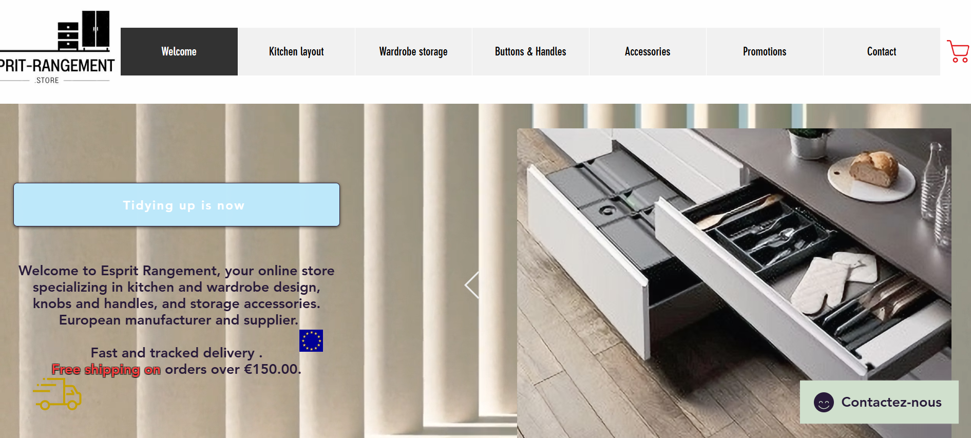
Esprit Rangement offers a broad catalogue of kitchen, wardrobe and storage accessories, but the existing website made that range difficult to explore.
The homepage relied heavily on individual product images with limited visual hierarchy, inconsistent spacing and weak separation between product categories. Visitors had to scan through a long page to understand what was available, while key categories such as kitchen storage, dressing solutions, handles and accessories competed for attention.
The overall experience did not fully communicate the specialist nature of the business or make product discovery feel simple and intuitive.
What We Built
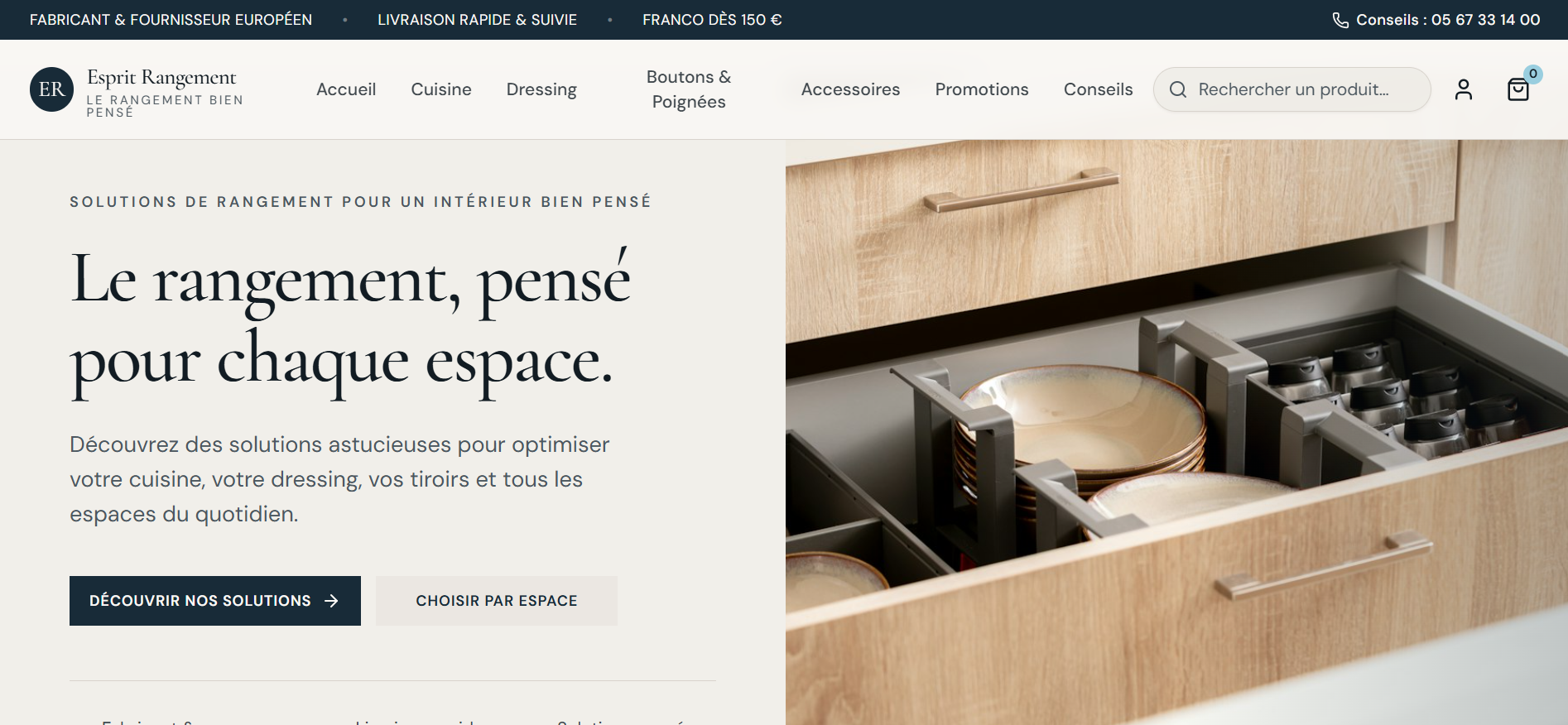
OlsamTech reimagined the website around a clearer, more structured shopping journey.
Instead of presenting the catalogue as one continuous collection of products, we created a more intentional visual experience that helps customers discover solutions based on space, need and product category.
The redesign introduced stronger content hierarchy, clearer category navigation, improved calls-to-action and a more refined presentation designed to make the extensive product catalogue feel easier to understand and shop.
Technology
Our Role
OlsamTech handled the digital experience strategy and redesign direction, including:
User experience and interface redesign
Homepage restructuring
Product-category architecture
Visual hierarchy improvements
E-commerce conversion strategy
CTA optimization
Responsive experience planning
Brand presentation refinement
Results
The redesigned experience gave Esprit Rangement a clearer and more professional digital storefront, with stronger product categorisation, improved visual hierarchy and a more intuitive path from discovery to purchase.
The new structure better communicates the breadth of the catalogue while helping customers identify relevant storage solutions without having to navigate an overwhelming product-first layout.
Product discovery
Shopping journey
Screenshots



Ready to launch a similar project?
Tell us where you want to go. We'll help shape the right way forward.